How to Choose a Paint Color You Won’t Regret: 7 Proven Tips
Choose a paint color with confidence using these proven tips on undertones, lighting, testing, and room flow before you commit.
Choosing a paint color sounds simple until you’re standing in a store aisle holding twelve nearly identical shades of white, wondering why this is somehow harder than picking a car. It’s not just you. Paint color decisions carry more weight than most people expect, because a wall isn’t a small thing. It’s the backdrop to every piece of furniture, every photo, every morning you walk into that room half awake. Get it wrong and you’re staring at a mistake for years, or paying to fix it sooner than you’d like.
The good news is that most paint regret comes down to a handful of avoidable errors: skipping the undertone check, testing in the wrong light, or picking a color before anything else in the room is settled. None of these mistakes are complicated to fix once you know what to look for.
This guide walks through a practical, tested process for how to choose a paint color you’ll still like a year from now, not just the day you painted it. We’ll cover undertones, lighting, sample testing, room function, and the small details that separate a color that looks great on a chip from one that actually works on your walls. By the end, you’ll have a clear system instead of a guessing game.
EXPLORE THE CONTENTS
Why Choosing a Paint Color Feels So Hard
Before getting into the steps, it helps to understand why this decision trips up so many people. Paint color isn’t judged in isolation. It reacts to everything around it: the direction your windows face, the color of your flooring, the finishes on your cabinets, even the color of your neighbor’s house reflecting through the glass. A shade that looks warm and inviting in one home can look flat or muddy in another, even with identical paint.
There’s also the sheer volume of choice. Major paint brands offer thousands of colors, and most of them look deceptively similar on a small chip. Add in the fact that paint color decisions often get made under time pressure, right before movers arrive or a room needs to be ready, and it’s easy to see why so many people end up repainting within a year.
Knowing this upfront changes how you approach the process. Instead of hunting for “the one” color on your first trip to the store, treat it as a short experiment with a few clear checkpoints.
1. Start With What You’re Not Changing
The single biggest mistake people make is picking their paint color first and building everything else around it. Flip that order. Before you even open a fan deck, take stock of the things in the room that are staying put:


- Flooring (hardwood, tile, carpet)
- Countertops or cabinetry
- Large furniture pieces you’re keeping
- Any built-in fixtures, like a brick fireplace or stone surround
These fixed elements have their own undertones, and your wall color needs to sit comfortably next to them. A gray paint that looks neutral on its own can suddenly read blue or lavender next to warm oak floors. Choosing a paint color that respects what’s already in the room saves you from a mismatch you can’t easily undo.
If you’re decorating from scratch, pick your rug, sofa, or a piece of art you love first, then pull your wall color from that. Interior designers do this constantly because it guarantees the palette holds together.
2. Understand Undertones Before You Commit
This is the step most people skip, and it’s the one that causes the most regret. Every paint color, even a plain white, has an undertone: a faint secondary hue that shows up more once it’s on a large wall under real light. A “white” paint might carry a hint of yellow, pink, green, or blue. A “gray” might lean warm (closer to greige) or cool (closer to blue-gray).
To spot undertones before you paint:
- Hold the paint chip next to a pure white sheet of paper. The undertone becomes much easier to see by comparison.
- Compare the chip in both daylight and artificial light, since undertones shift depending on the light source.
- Look at the paint names and family groupings on the fan deck. Manufacturers usually organize colors by undertone, which gives you a hint even before testing.
According to Sherwin-Williams, fixed features like cabinet wood tone should factor directly into your color selection, since a warm-toned wood can clash badly with a cool-undertone paint. Getting the undertone right is what separates a color that feels intentional from one that just feels off, even if you can’t say exactly why.
3. Pick a Feeling, Not Just a Swatch
Before you narrow down actual paint names, decide what you want the room to feel like. Cozy and warm? Calm and airy? Bright and energetic? This single step gives you a filter for every other decision that follows.
A few starting points:
- Warm tones (reds, oranges, yellows) tend to make a room feel inviting and energetic, which works well in dining rooms or living spaces where people gather.
- Cool tones (blues, greens, soft grays) create a calmer, more restful feel, often suited to bedrooms and bathrooms.
- Neutrals (tan, greige, soft white) act as a flexible backdrop that lets furniture and art do the talking.
Once you know the feeling you’re after, you’ll stop getting pulled toward trendy colors that don’t actually match how you want to live in the space. This is one of the most overlooked parts of learning how to choose a paint color that still feels right after the initial excitement fades.
4. Test Paint Samples the Right Way
This is the step that saves the most regret, and it’s also the step people rush through most. A tiny paint chip under store lighting tells you almost nothing about how a color will look on your actual walls.
Use the Largest Swatches Possible
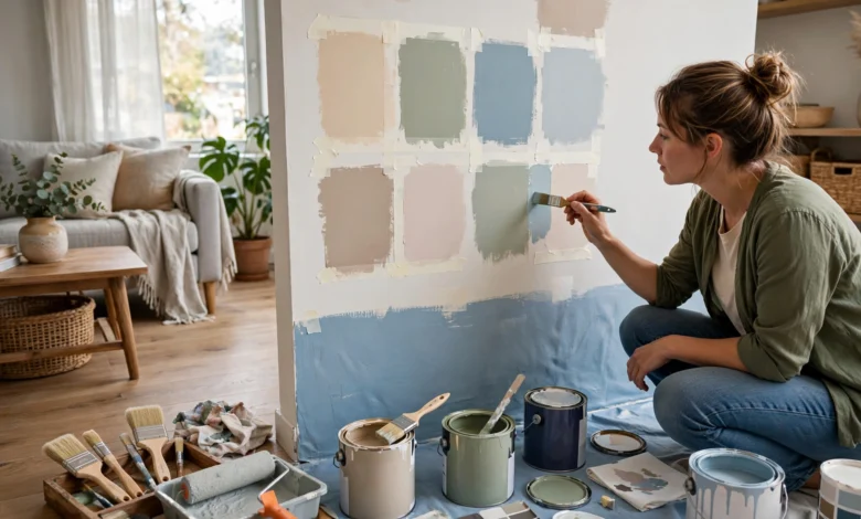
Small chips are nearly useless for judging a true color. Order the largest sample sheets your paint brand offers, or better yet, buy a sample-size pot and paint a large swatch directly onto poster board. This gives you a movable test piece you can hold up against furniture, flooring, and trim in different spots around the room.
Watch the Color Change Throughout the Day
Paint color shifts dramatically depending on the time of day and the direction your windows face. A color that looks perfect at noon can look completely different at dusk under lamp light. Leave your test swatch up for at least 24 to 48 hours and check it in the morning, midday, and evening before deciding.
Paint on Poster Board, Not Directly on the Wall
Painting swatches straight onto the wall means patchy test spots everywhere and extra work covering them later if you change your mind. Painting two coats onto poster board, then moving it around the room, gives you a cleaner and more flexible way to judge the color against every wall, not just one.
This Old House recommends starting with an object you already love in the room, like a pillow or piece of art, as the anchor for your palette, then testing candidate colors against it in the actual space before making a final call.
5. Consider the Room’s Function and Size
Not every room needs the same approach. How a space is used should directly shape which paint color makes sense there.
- Small rooms or rooms with little natural light often benefit from lighter, warmer neutrals that keep the space from feeling closed in. Going too dark in a windowless room can feel heavy rather than cozy.
- Large, open rooms can handle bolder or darker colors without feeling overwhelming, since there’s enough space to balance the intensity.
- High-traffic rooms like kitchens, hallways, and mudrooms tend to do well with more durable, easy-to-clean finishes in addition to the right hue, since these walls take more wear.
- Bedrooms and bathrooms often lean toward softer, calmer colors, since these are spaces meant for rest rather than energy.
Ceiling height and room shape matter too. A lighter ceiling color can make a room feel taller, while a darker one on shorter walls in a narrow room can help balance proportions. These details are easy to overlook but make a noticeable difference once the paint is actually up.
6. Use the 60-30-10 Rule for a Balanced Palette
If you’re pulling together a full color scheme rather than a single wall, the 60-30-10 rule is a simple, reliable framework. It breaks a room’s palette into three proportions:
- 60% dominant color — typically your walls
- 30% secondary color — furniture, rugs, or large upholstered pieces
- 10% accent color — pillows, art, and small decor details
This ratio keeps a space from feeling either too bland or too busy. When you’re trying to choose a paint color, thinking of it as the 60% anchor of the room, rather than a standalone decision, makes it much easier to see whether it will actually work with everything else you own or plan to buy.
7. Think About Flow Between Rooms
If you’re painting more than one room, it’s worth stepping back and thinking about the whole house rather than picking colors room by room in isolation. Open floor plans especially need this kind of planning, since walls in adjoining spaces are often visible from each other.
A few ways to keep flow consistent:
- Choose one neutral as a connecting thread through hallways, entryways, and transitional spaces.
- Vary the intensity of a single color family from room to room instead of switching to something completely unrelated.
- Keep trim and ceiling colors consistent throughout the home, even if wall colors change, to create a sense of continuity.
This doesn’t mean every room needs to match. It just means neighboring colors should feel like they belong to the same story rather than clashing the moment you walk from one space into the next.
Common Paint Color Mistakes to Avoid
A quick recap of the errors that lead to the most repainting regret:
- Choosing paint color first, before flooring, furniture, or fabric choices are settled.
- Skipping the undertone check, which leads to walls that look “off” without an obvious reason.
- Testing only in the store, under fluorescent lighting that doesn’t match your home.
- Judging color from a tiny chip instead of a large sample swatch.
- Ignoring the room’s natural light direction, which changes how warm or cool a color appears throughout the day.
- Going too trendy, chasing a color because it’s popular online rather than because it fits your space and habits.
Avoiding these few pitfalls solves the majority of paint regret before it happens.
When to Call In a Professional
If you’ve tested several samples and still can’t settle on a direction, or you’re trying to coordinate color across an entire home, a color consultation with a designer or paint specialist can be worth the cost. Many paint retailers, including Benjamin Moore and Sherwin-Williams, offer in-home color consultations, and a trained eye can often spot undertone clashes or lighting issues that are hard to catch on your own. This is especially useful before a large project, like painting an entire main floor, where a mistake is expensive to fix.
Conclusion
Learning how to choose a paint color you won’t regret really comes down to slowing down the process just enough to test it properly. Start with what’s already fixed in the room, understand the undertone of any color you’re considering, decide on the feeling you want before you fall for a specific shade, and always test large swatches in your actual lighting over a full day or two. Factor in the room’s size and function, lean on the 60-30-10 rule for a balanced palette, and think about how each room connects to the next if you’re painting more than one space. None of these steps take much extra time, but together they’re what stand between a color you love for years and one you’re repainting within a season.